Life At Druva

Up and to the right: Druva’s new brand

Josh Gillick

As we are advancing the world of data protection and management, our brand has taken the same journey and we are excited to share it with you.

More than data protection
Druva has always been unique. Unique in the sense that our co-founders, Jaspreet Singh and Milind Borate, started this journey to develop the first cloud-native data protection solution in the industry, and that they did.

The tech world that we live in is continuously evolving, and Druva is evolving as well. Over the past several months, our team has been redefining the image that we present outside of our own four walls. Let’s take a look at the updated brand:


The new logo
Why change a good thing? The Druva logo has served us well for the last 10+ years…so we gave it fresh update. What did we change? We made our name more legible and kept our adored North Star, while elevating it up and to the right.

Druva’s new brand


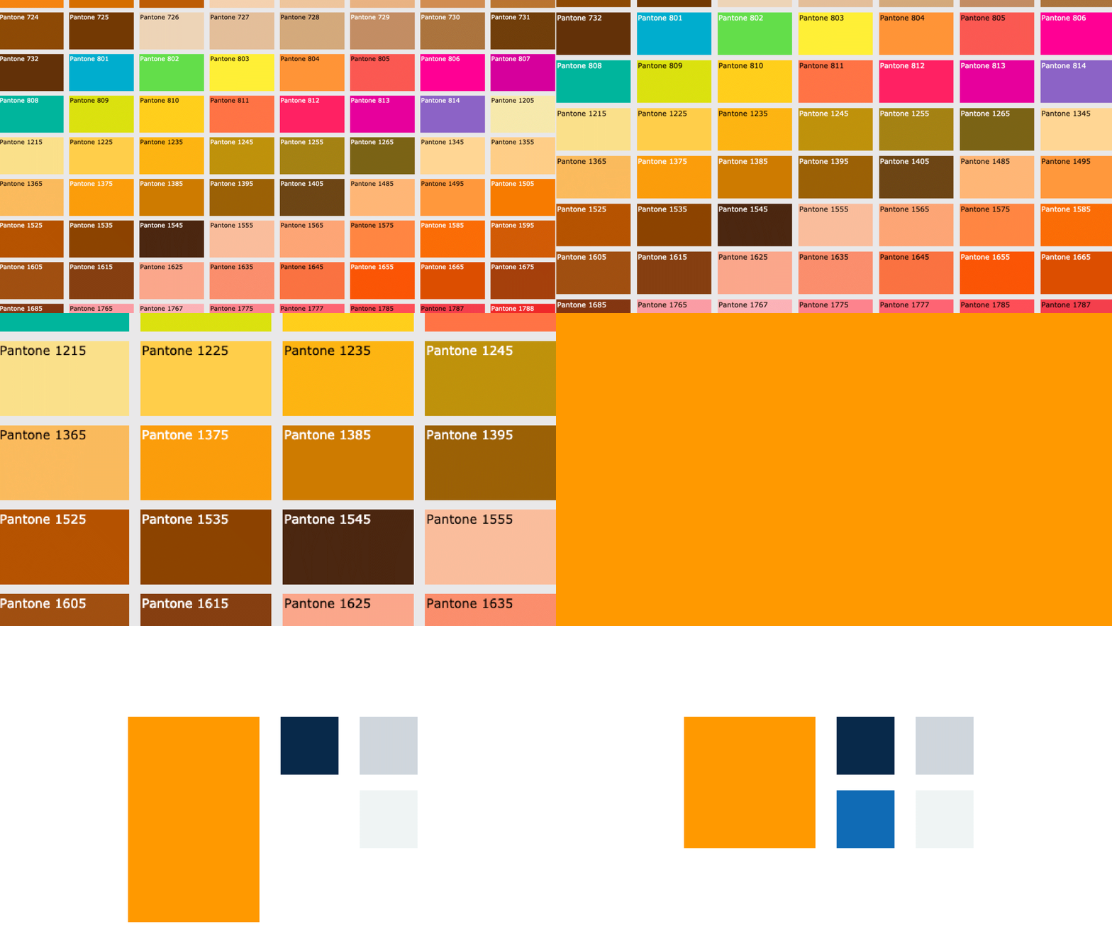
New brand color
Green is such a great color…but to us, Orange (Pantone 1375C) signifies best in breed SaaS infrastructure…the powerhouse that Druva sits on. So as a nod to our friends over at AWS we’ve chosen go all in!

Druva’s new brand


Visual language
Data is an invisible force moving around us everyday. Visualizing the speed, capacity, power, and capability of Druva and AWS is no simple task. Across the brand, bright abstract visualization of data as particles, light bursts, connected points, and colorful surreal patterns serve to tell our story.

Druva’s new brand


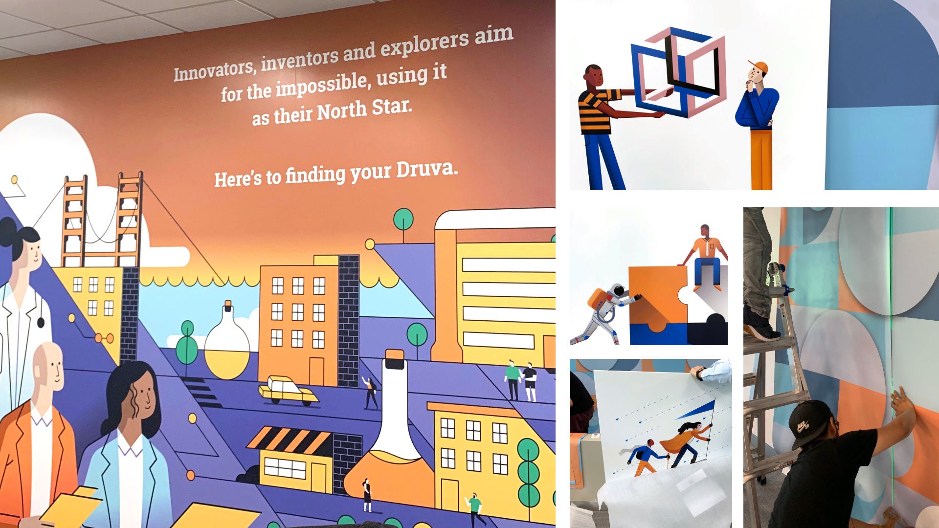
Branding of our offices
Aiming for the stars—our goal was to do more than just show a night sky with a bright star—we wanted everyone to be able to feel our aspirations in a way that, in turn, relates to every part of their lives.

The night sky and the North Star has always been associated with explorers, dreamers, and innovators. All of us have big ideas, goals and dreams and Druva is a company full of these such people.

From Illustrator Tony Bui
When Josh Gillick first pitched the idea he had, I initially thought it was visually not going to work. I thought to myself, “This sounds insane, but I will try to draw it, anyway.”

The visual themes for this wall were time and innovation. Time would be represented through a shift from morning to night. Innovation was embodied in this fantasy type-of-metropolis, where walking streets intersected with data and science.

To add a visual dynamic, I added lots of diagonal elements that would break up space and create new exciting shapes.

More to come
We are so very proud to present the new Druva brand, everyone has been working diligently towards this goal. This is a collaborative effort, and we want to thank everyone involved in bringing this updated brand to life. Here’s to #TheNewDruva!

If you are interested in joining the Druva team, visit our careers page or read about our new Druva global headquarters.