Druva’s innovative approach to data protection has transformed how organizations across the globe see data as a business asset instead of an IT headache or ransomware liability. At Druva, not only do we provide best-in-class solutions for your data resilience needs but also try to make sure that your interaction with our platform is easy and intuitive. In this blog, we are going to talk about the new changes that we have introduced on Druva’s platform dashboard and how you can leverage them to enhance your in-product experience.
Before this update, the Druva dashboard showed an aggregated view of all the workloads you’d configured and a set of static links to navigate to the different workloads and services supported by Druva. However, we learned from the data that the usage varies as per the role. You also told us that it is quite cumbersome and time-consuming to navigate to different parts of the console to get an overview of the information that is most important to you.
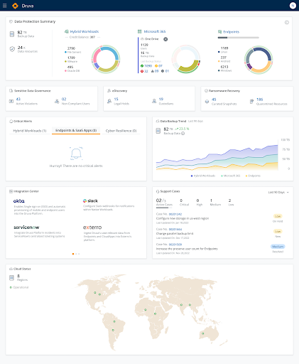
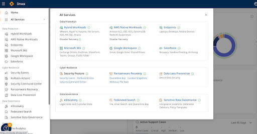
We listened to your feedback and we’re happy to announce that we have come up with a revamped dashboard experience for the Druva Data Resiliency Cloud. The redesign provides you with a workload-centric view of all workloads and services that you have configured — giving you a high-level overview of metrics such as total resources configured, their backup size, last backup status, critical alerts, and many more. Not only this, the revamped dashboard allows you to navigate quickly to the pages you visit the most with a single click.
This is how the new dashboard experience looks:


